Extending / Intermediate / Custom Field Types
Note: You are currently reading the documentation for Bolt 3.7. Looking for the documentation for Bolt 5.2 instead?
The release of Bolt 3.0 has seen a significant amount of power and flexibility added to custom fields. In the 2.x series of releases custom fields did not have access to the entire lifecycle of a field and was focused more on providing replacement templates for the built in storage types.
With this in mind, the following tutorial is a reworking of the one originally written for the 2.x documentation, it no longer represents best practice for custom field development, for that please see the latest tutorial here.
What this updated tutorial will be useful for is to see what changes will be needed to update field extensions to be compatible with Bolt 3.
Task: Add a Colour Picker to Bolt
Wouldn't it be good if we could allow editors of your site to add a splash of colour to a page banner?
Possibly not, but that's no reason to not try, so we're going to add a new field type to Bolt that allows content editors to pick a colour. Here's a step-by-step guide of how to build and test this extension.
Step 1: Configure the extension
As with all Bolt extensions we need to get started with a configuration
composer.json file. So we make a new directory for our extension called bolt- colourpicker and then within the directory type git init. This gets us setup
with a clean empty project.
Next comes the configuration, we'll keep things nice and simple so here's the essentials:
{
    "name": "bolt/colourpicker",
    "description": "An extension to add a colourpicker as a field type within Bolt",
    "type": "bolt-extension",
    "require": {
        "bolt/bolt": "^3.0"
    },
    "license": "MIT",
    "authors": [{"name": "Ross Riley", "email": "riley.ross@gmail.com"}
    ],
    "autoload": {
        "psr-4": {
            "Bolt\\Extensions\\Bolt\\ColourPicker\\": "src"
        }
    },
    "extra": {
        "bolt-assets": "web",
        "bolt-class": "Bolt\\Extensions\\Bolt\\ColourPicker\\ColourPickerExtension",
        "bolt-screenshots": ["screenshot.png"]
    }
}
The autoload section maps the root of our extension directory to the PHP namespace, if you've not yet used PSR-4 autoloading for your PHP code, it's probably good at this point to take a look at some examples from the standard documentation here.
Within the extra section we configure two essential bits of information that
Bolt uses to run the extension, firstly the bolt-class setting tells Bolt
which class can be used to bootstrap this extension. This will be the fully
qualified class name, but with two back-slashes to separate namespace paths.
Then the bolt-assets setting tells Bolt which folder stores assets that need
to be publicly available. On install Bolt will then copy the assets in this
folder to an accessible public folder.
The Extension Class
Now it's time for the heavy lifting, we need to write our extension class. To
conform to the standard Bolt Extension interface we need to extend the utility
class SimpleExtension and implement a few methods that will define the
features our extension provides.
The most important part is that we will need to extend the built in
ConfigProvider and add our new field.
First of all, here's the final version of the file that we need to make the extension, then we'll have a quick run-through of why we need each of these setup methods.
<?php
// File is in src/ColourPickerExtension.php
namespace Bolt\Extensions\Bolt\ColourPicker;

use Bolt\Asset\File\JavaScript;
use Bolt\Asset\File\Stylesheet;
use Bolt\Controller\Zone;
use Bolt\Extension\SimpleExtension;
use Bolt\Extensions\Bolt\ColourPicker\Field\ColourPickField;

class ColourPickerExtension extends SimpleExtension
{
    public function registerFields()
    {
        return [
            new ColourPickField(),
        ];
    }

    protected function registerTwigPaths()
    {
        return [
            'templates' => ['position' => 'prepend', 'namespace' => 'bolt']
        ];
    }

    protected function registerAssets()
    {
        return [
            Stylesheet::create('css/colourpicker.css')->setZone(Zone::BACKEND),
            JavaScript::create('js/colourpicker.js')->setZone(Zone::BACKEND),
            JavaScript::create('js/start.js')->setZone(Zone::BACKEND),
        ];
    }
}
Our colourpicker is primarily based on the jQuery Simple Colorpicker
so we need to add both the css and javascript assets to the Bolt markup, we also
add a start.js file which will initalize the javascript.
These are all added in the registerAssets method, all this method needs to do
is return an array of asset objects so we make a new object either new JavaScript(xxx) or new Stylesheets(xxxx) depending on what we need. These
files are loaded relative to the root of the extension so web/colourpicker.css
loads from the web directory.
Next we need to add our own custom field onto the built in field manager. To do
this we need to create a function called registerFields() that will return an
array of one or more classes that implement Bolt\Storage\Field\Type\FieldTypeInterface.
This block does just that:
    public function registerFields()
    {
        return [
            new ColourPickField(),
        ];
    }
Finally we want to add our extension's template directory to the system so that
Bolt knows it needs to look here for extra templates. We do that by returning an
array from the registerTwigPaths() method. The precise syntax we use is:
protected function registerTwigPaths()
{
    return [
        'templates' => ['position' => 'prepend', 'namespace' => 'bolt']
    ];
}
The key of this array is the directory we want to add relative to the root of
the extension, the value is an array of options. Both of these settings tell
Bolt how and when to load templates from this directory, position => prepend
means that this directory takes precedence over the default templates, the
namespace is set to bolt as the template we are adding needs to appear in the
backend of Bolt and this is the namespace used. If you only want to make
templates available in the frontend then you can omit the namespace.
The Field Class
You can see in the provider class above we added a new instance of
ColourPickField to the Bolt field manager. Any new field needs to implement the
Bolt\Storage\Field\Type\FieldTypeInterface which has a few fairly simple
requirements.
We firstly need to tell Bolt what name the field will use (this is how it will
be set in contenttypes.yml) and also what template will be used to render the
field.
Here's the final code for our new field:
<?php
// File is in src/Field/ColourPickField.php
namespace Bolt\Extensions\Bolt\ColourPicker\Field;

use Bolt\Storage\Field\Type\FieldTypeBase;

class ColourPickField extends FieldTypeBase
{
    public function getName()
    {
        return 'colourpicker';
    }

    public function getTemplate()
    {
        return '@bolt/_colourpicker.twig';
    }

    public function getStorageType()
    {
        return 'text';
    }

    public function getStorageOptions()
    {
        return ['default' => ''];
    }
}
The Template File
Finally we need a template file that specifies how our field looks in the
content editor. Note that this template's name will be the name returned by the
getTemplate() method in our field class shown above, in this example the file
is named _colourpicker.twig.
Here's how our _colourpicker.twig template takes shape:
{#=== Options ============================================================================#}

{% set attr_opt = {
    class:        field.class|default(''),
    name_id:      key,
    required:     field.required|default(false),
    readonly:     field.readonly|default(false)
}%}

{#=== FIELDSET ============================================================================#}

<fieldset class="colourpicker">
    <div class="col-sm-12">
        <div>
            <label class="control-label">{{ field.label|default(key|humanize) }}</label>
        </div>
        <select data-colourpicker {{ macro.attr(attr_opt) }}>
            {% for valuekey, value in field.values %}
                <option value="{{ valuekey }}"{% if valuekey == context.content.get(key) %} selected="selected"{% endif %}>
                    {{value}}
                </option>
            {% endfor %}
        </select>
    </div>
</fieldset>
As you can see the field under the js is a select dropdown of colour options.
When you define your own field, all of the options specified in
contenttypes.yml are available within the field object. Some of the
potential values are accessed in the options block. In the case of our
colourpicker field, we will look for a list of values and use the key/value
to build the option list.
The Final Completed Extension
We now have a completed extension and can add it to our Bolt site. Firstly we
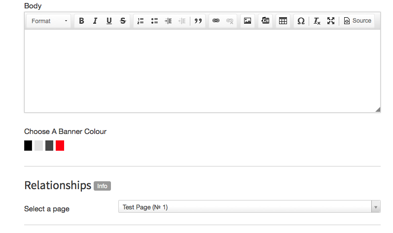
need to add the field to our contenttypes.yml file. We add a field like this:
    banner:
        type: colourpicker
        label: "Choose A Banner Colour"
        values:
            "#000": Solid Black
            "#E1E1E1": Almost White
            "#444": Dark Grey
            "#FF0011": Bright Red
Our new ColourPicker Field
The Source Code
It's a good idea to look at the final source code for this extension to help you get started making a similar one. There is a repository on GitHub here.
Couldn't find what you were looking for? We are happy to help you in the forum, on Slack or on Github.