User Manual / Field types
Note: You are currently reading the documentation for Bolt 5.0. Looking for the documentation for Bolt 5.2 instead?
Text and HTML fields
Text

A normal text input, often used for titles, short captions and alike.
Textarea

A longer text input, often used for text that should be unstyled and 1 - 5 paragraphs in length.
Markdown

A Markdown field. Markdown allows you to write using an easy-to-read, easy-to-write plain text format, which then converts to valid HTML for viewing on the frontend. Often used when text needs minimal custom styling but still needs to be able to be sectioned or formatted. Highly recommended if you feel comfortable using it.
HTML

A WYSIWYG field that allows greater freedom to edit styling and presentation of text. Often used for the body of a page or article. Features of the WYSIWYG can be turned on or off in the Main configuration.
Redactor field

A WYSIWYG field that allows greater freedom to edit styling and presentation of text with the advantage of adding extra functionality and custom options and buttons to make the editing experience more pleasant.
Article field
A powerful WYSIWYG text editor for creating rich content. It can work with grids, cards, templates and other components of website.
WYSIWYG editors
There are different text editors in Bolt and each of them are more suitable for a specific type of site but in general lines all of them provide the same basic text editing options.
The text is entered directly in the editing area of the editor. To style, format or enrich the text please read the following topics.
Text and paragraph formatting
The format of the text can be changed by clicking the format button on the editor's toolbar.

It allows the selection of a different format from the list. In some cases you will be aware of the format change directly in the editing area. You can select any of the following options:

- Normal text: It's the default format. This is the most used when editing content.
- Quote: It allows to format the text as a quote. Use it when you want to add a quote to the content of your webpage.
- Code: It formats the text as code meaning that the main purpose of this format is to be used on text that represents code. For example: PHP, Twig, HTML... any coding language
- Heading 2: It formats the text with a level 2 heading (<h2>).
- Heading 3: It formats the text with a level 3 heading (<h3>).
- Heading 4: It formats the text with a level 4 heading (<h4>).
- Heading 5: It formats the text with a level 5 heading (<h5>).
Text styling
The style of the text can be changed selecting one of the following options:
Bold

Makes the text bold adding a darker color to the text.
This helps to emphasize words and sentences in a text.
Italic

Makes the text italic.
This is used to emphasize or contrast part of the text.
Rich text
It is just not plain text what you can use to create the content of the page. The WYSIWYG editor allows you to add rich text and media.
Lists

The lists button allows you to select from different types of lists and create nested lists.

- Unordered List: It sets the writing mode to bullet points lists. It will add a new bullet point to the list when you press Enter.
- Ordered List: It sets the writing mode to a numbered list starting at 1. It will add the next number when you press Enter.
- Outdent: It removes an item or su item from the list.
- Indent: It adds a sub item to the list.
How to create nested lists

To create nested lists you will need to do the following:
- Click on the lists button and select a type of list, ordered or unordered list.
- Write the text for the first item of the list.
- Write the text for the second item of the list and click on the list button and select the Indent option.
- Repeat steps 2 and 3 as many times as you need
- To go back one level in the nested list use the option Outdent from the lists button options list.
Tables

The Table button allows you to select different options for creating tables in your content. You can choose the following options:

- Insert table: It adds a default 3x3 table to your content.
- Insert row above: It adds a new row above the row where the text cursor is positioned.
- Insert row below: It adds a new row below the row where the text cursor is positioned.
- Insert column left: It adds a new column to the left of the text cursor position.
- Insert column right: It adds a new column to the right of the text cursor position.
- Add head: It adds a header to the table. This is the first row of the table.
- Delete head: It removes the header from the table.
- Delete column: It removes the column where the text cursor is positioned.
- Delete row: It removes the row where the text cursor is positioned.
- Delete table: It removes the table from the content.
How to create tables

- Click on the Table button and select Insert table.
- Add as many columns as your table need by clicking on the Table button and selecting either Insert column left or Insert column right.
- If your table has a header, click on the Table button and select Add head.
- Add text to the header and rows of the table
- If necessary add extra rows by clicking on the Table button and selecting either Insert row above or Insert row below.
- Remove rows, columns and header when necessary by using the options Delete head, Delete column or Delete row.
To entirely remove a table that is not needed anymore in your content use the Delete table option.
If you accidentally remove a table you can revert the changes by clicking Ctrl + Z
Images

The image button allows you to add images in the text.
There are two options to select the images for your content:
-
Upload the image from your PC.

Click on the upload panel to open your system file browser window or directly drag and drop the image into the upload panel area.
-
Select an image from the server.

Click on the "Choose" tab and select the image you want to add to your content. This is a collection of images that have been previously uploaded to the server.
Video

The video button allows you to embed videos in your content.
To add a video click on the video button and paste the link to the Youtube/Vimeo or the embed code in the text area and click "Insert".

Date Field
Date

A field for a single date with or without time. See https://docs.bolt.cm/4.0/fields/date#jumpbutton for options
Media fields
Image

A field for a single image, allows for them to be uploaded, selected from the
server or selected from the stack. Optionally can include alt and title
attributes.
Imagelist
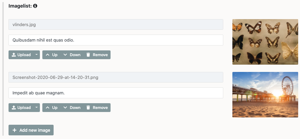
A field for multiple images, with the same ways to add images as the image field. Also allows for a line of text to be attached to each image.
File
A field for a single file, allows for them to be uploaded, selected from the server or selected from the stack.
Filelist
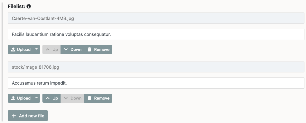
A field for multiple files, with the same ways to add files as the file field. Also allows for a line of text to be attached to each file.
Embed

A field for embedding videos and other content from websites like Youtube and Vimeo. Also allows selection of size of the video and previewing of it.
Number-based fields
Checkbox

A field to store "True or false" type values. Internally stored as either 1 for true if the checkbox was checked, and 0 for false if it wasn’t checked.
Number (mode: integer)

A field to store whole numbers. The value must be between -2147483648 and +2147483647. Often used for storing things like prices of products.
Number (mode: float)

A field to store decimal numbers. Internally stored so that they can be sorted numerically.
Select fields
Select

A drop-down list to make a pre-defined selection from. There are two ways of specifying the list of available options. Either predefined options or by selecting from a ContentTypes records.
Multiselect

A selectfield that allows for multiple items to be selected.
Bolt-specific fields
Templateselect

Allows one to choose a specific template for each particular record.
Slug

This field will determine what "slug" or permalink is used for accessing the record on the frontend.
Meta information
This section will be present in all ContentTypes and allows for a few different options:

Publication date
This will determine when the record will be published if used in conjunction with the status "Timed publish".
Depublication date
This will allow for the record to be depublished after a certain date and time.
Status
This allows you to decide the status of the record. The choices are:
- Published
- Held
- Draft
- Timed publish
Relations and taxonomy
Relations

Relations allow you to tie a record to another record of either the same or a different ContentType for usage in your templates. An example of this is often seen on ecommerce websites that have a "related products" section.
Taxonomy
Taxonomy allow you to categorize your record with different types of taxonomy set up in your taxonomy file. There are three different types of taxonomy:
- tags - Tags are a sort of ‘freeform’ labeling. Each record can have several tags, that do not have to be selected from a predefined list. Just add tags, as you go! Examples of websites that use tags extensively are Flickr or Delicious. The taxonomy can be set up to allow spaces in tag names or not.
- categories - Categories are chosen predefined categorizations for your record. These are often found on weblogging sites, to define the different types of blogpostings. The taxonomy can be limited to either one or more categories for each record.
- grouping - Grouping is like categories but it is - by definition - more strict. When a grouping applies to a certain record, that record should be viewed as a part of the other records with the same grouping. As such, a record can have only one ‘grouping’ at most.
Couldn't find what you were looking for? We are happy to help you in the forum, on Slack or on Github.