Field Types / Collection field
Note: You are currently reading the documentation for Bolt 4.0. Looking for the documentation for Bolt 5.2 instead?
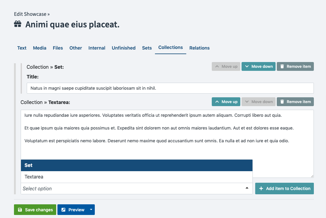
A special field type available as a field definition is the collection field
type which allows you to compose an array-like structure of sub-fields within a
single field.
Basic Configuration:
The configuration of a repeating field comprises the main field name,
along with the definition of the sub fields under the fields key.
        features:
            type: collection
            fields:
                title:
                    type: text
                image:
                    type: image
                    extensions: [ gif, jpg, png ]
                content:
                    type: html
As you can see the field is configured with a type of collection and then the sub-fields
are configured under the fields attribute. You can include any valid fields
within a collection, there are a few that are not supported.
Note: Collections are useable with most of the
available field types, except where
it simply does not make sense to have more than one of. In short, do
not use type: slug, type: collection or
type: templateselect as fields in
your collection. These fields will not work as expected.
You can move and sort fields inside collections, but don't forget to save your record after sorting.
Example usage in templates:
When you want to use collections in your templates you will need to iterate over the collection in order to access the individual fields.
For instance if you just want to iterate over all fields in the order they are saved then the template code will look like this:
    {% for feature in record.features %}

        {{ feature.type }}:

        {% if feature.type in ['text', 'html', 'textarea', 'markdown'] %}
            {{ feature|raw }}
        {% elseif feature.type == 'image' %}
            {{ showimage(feature) }}
        {% else %}
            {{ dump(feature) }}
        {% endif %}

    {% endfor %}
In the example above using {{ feature }} will just output the value of the
sub-field, if it is a text field such as like text, html, textarea or
markdown. Since these are sometimes more complex fields you can use
{{ thumbnail(field) }} or {{ showimage(field) }} for images or
{{ dump(field.value) }} to dump the field (with value) regardless of type.
If you know the names of the fields you want to render then you can fetch the fields from the collection by name or by type. Because of the nature of a Collection Field, we shouldn't assume by default there's only one field of type text, or even that there's only one field named "introduction".
In that light, it's usually good practice to always use a for loop to iterate over them. The examples below will grab the fields named content or all of the type: text fields. We do this with Twig's filter filter
{% for feature in record.features|filter(feature => feature.name == 'content') %}
    {{ feature }}
{% endfor %}

{% for feature in record.features|filter(feature => feature.type == 'text') %}
    {{ feature }}
{% endfor %}
If you're certain a collection has one field of a type or name, you can avoid the for loops. For instance using the same example as above but knowing that our collection comprises the individual sub-fields
companyname, telephone and email we can output the fields like this:
{% set companyname = record.features|filter(f => f.name == 'companyname')|first %}
{% set telephone = record.features|filter(f => f.name == 'telephone')|first %}
{% set email = record.features|filter(f => f.name == 'email')|first %}

Name: {{ companyname }}
Telephone: {{ telephone }}
Email: {{ email }}
Options
The field has three specific options:
limit: Limit how many collection items an editor is able to create. If you omit this setting, then an unlimited number of sets can be created. The configuration for that option looks like this:
        features:
            type: collection
            limit: 3
            collapsible: false
            fields:
                title:
                    type: text
                image:
                    type: image
                    extensions: [ gif, jpg, png ]
                content:
type: htmldefault_state: Whether the separate collection items of this Collections are collapsed in the backend. This allows the editor to get a better overview, if there are multiple collection items. The default iscollapsed, you can set it toexpandedto disable this feature.default: The default field option is also supported for a collection field. See the example for how to configure a default value for collections.
        features:
            type: collection
            fields:
                title:
                    type: text
                content:
                    type: html
                image:
                    type: image
            default:
                0:
                    field: title
                    default: "Lets start with a title"
                1:
                    field: image
                    default:
                        filename: "kitten.jpg"
                        alt: "Picture of a kitten"
                2:
                    field: content
                    default: "<strong>Finish strong</strong> after the kitten with some content"
Note: To set the default items inside a collection, you must
set the field name in the field config (e.g. field: title) and the default value for that item,
e.g. default: "Lets start with a title"`.
What is inside the item default will depend on the field type.
Couldn't find what you were looking for? We are happy to help you in the forum, on Slack or on Github.